Design Concepts
 Screenshot of the first design
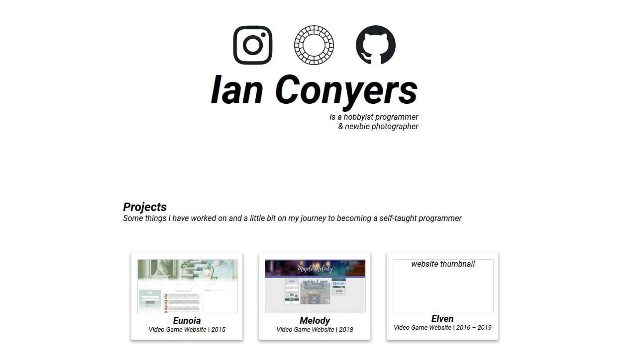
Inspired by someone in my family, I wanted a design that simply showed who I am. Having my own domain and website was cool enough to me and I knew coming up with a unique design isn't something that can happen immediately.
I had to think about what projects I even wanted to show. I started with the oldest websites and ordered them like a timeline. From left to right in a grid-type fashion, each project is shown with a thumbnail, name, and short description. Each cell was evenly sized and spaced for uniformity.
The core of the website was built using a PHP framework, CodeIgniter. It's lightweight, easy to use and most importantly, in a programming language I'm familiar with (PHP).
 Screenshot of the second design
The first design had too much white space. Nothing eye catching, nothing to leave an impression. I had an idea to use an abstract layout to show my projects. Basically, keeping that grid-type fashion, but instead of having each cell having the same sizing, each one keeps its original aspect ratio via the image size to break up the uniform look.
The width of the container is now fluid and a subtle background color was added to make the content pop.
 Screenshot of the third design
After leaving the website alone for several months I suddenly had an idea for a new design. Given that this website isn't large or complicated, I also decided to use a new framework, Remix.
Keeping things simple and concise, I decided to try and keep the content visible on the main page, before the fold. The fold represents the line in which content is cut off in the viewport. Anything you see when a page loads, without scrolling is considered "before the fold".
Of course, with more projects means more space taken and inevitably scrolling. A cool new thing I learned was sticky content. Sticky content allows elements to stay visible all the time even while scrolling. Awsome! I used this tech to keep the left column stuck on the page while allowing the right column to scroll. This way I can show my name and external links while being able to showcase as many projects as I'd like.
The right column contains thumbnails for each project. To make more projects visible within the viewport, the max-height is capped while the width is fluid. To spice up the design and user-interaction, upon hovering or clicking, the thumbnail is expanded to show the full image.